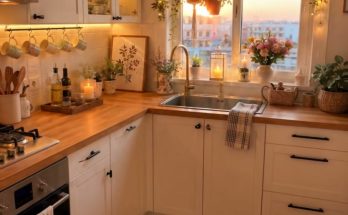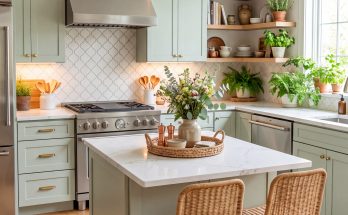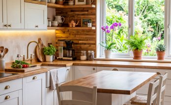
This kitchen is narrow, but it never feels boxed in. Sunlight travels across the wood counters, greenery softens the hard edges, and a slim island gives the room a useful center without stealing the walkway.
The result is warm, practical, and surprisingly spacious. The lesson is not that the room needs more cabinets or a larger footprint. It works because every visible element helps light, texture, or movement.
1. The windows do more than brighten the room
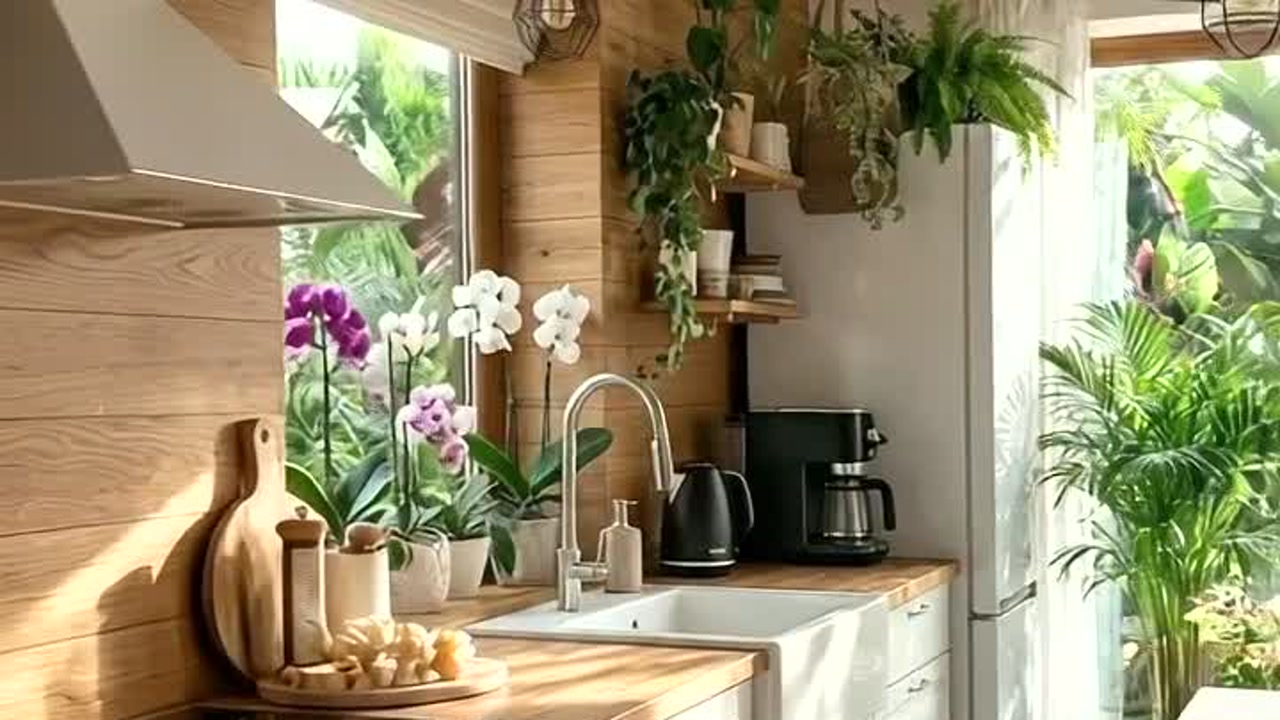
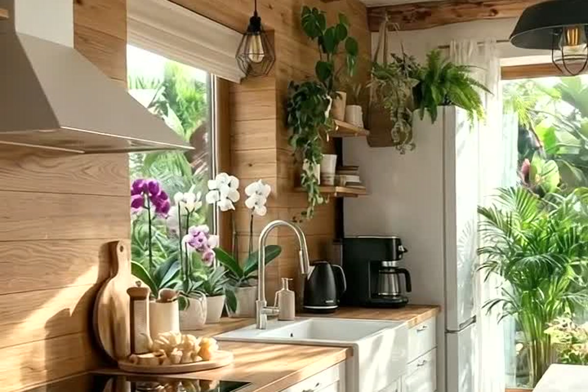
The largest window and glazed opening visually extend the kitchen into the garden. Instead of ending at a solid wall, the eye continues through layers of leaves and natural light. That borrowed view makes the room feel deeper than its physical dimensions.
Notice how the worktop stays relatively clear near the glass. The sink, coffee station, and plants create useful zones, but none of them builds a heavy visual barrier. This allows daylight to travel across the white cabinetry and down the length of the room.
2. Repeated wood creates one continuous story
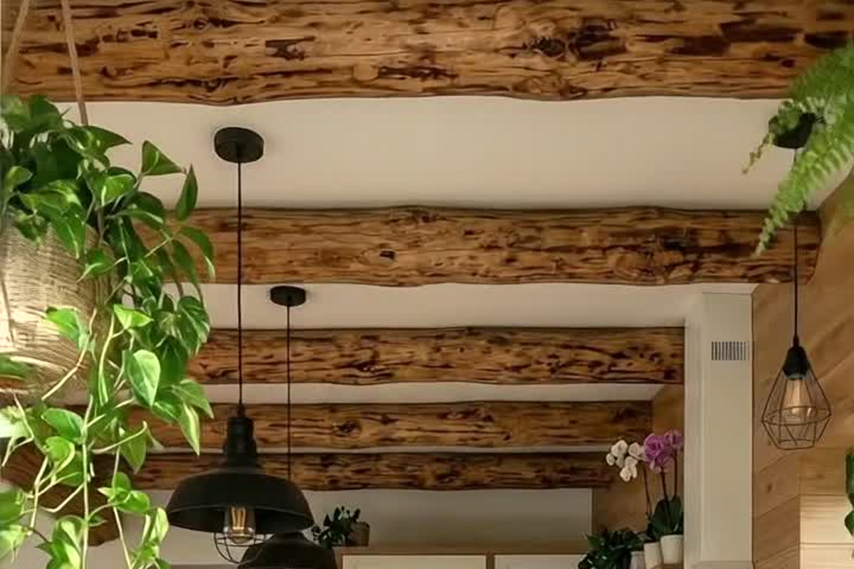
Wood appears on the counters, wall cladding, shelving, floor, island top, and exposed ceiling beams. Those surfaces are not perfectly matched, and that is part of the charm. Their different grains and tones make the kitchen feel collected rather than purchased as a single showroom set.
The repetition also gives the design coherence. Because the same warm material appears from floor to ceiling, the eye moves smoothly through the room. The strong beams above could have felt heavy, but the pale ceiling between them keeps the pattern rhythmic and open.
3. White cabinetry reflects light instead of competing with it
The cabinet fronts are quiet and traditional, with simple recessed panels and restrained hardware. Their pale finish bounces sunlight through the room and keeps the long cabinet runs from becoming visually dense.
This is especially effective in a narrow layout. Dark lower and upper cabinets on both sides could make the walkway feel like a corridor. Here, white surfaces recede while the wooden counters provide enough warmth to prevent the room from feeling clinical.
4. Plants create depth at every height
The greenery is doing more than decorating. Hanging vines frame the ceiling line, orchids add color near the work surface, and larger leaves connect the interior with the garden outside. Because plants appear at several heights, the room feels layered rather than flat.
The most effective placements are around corners, shelves, and windows—areas that might otherwise look empty or abrupt. The leaves soften those transitions without reducing the useful counter space in the main preparation zone.
5. A slim island adds function without blocking movement
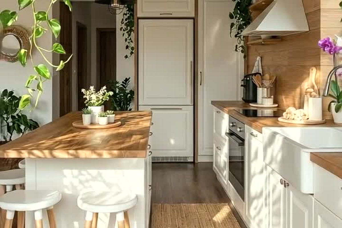
The island is long and narrow, matching the proportions of the room. It provides preparation space, casual seating, and a strong visual anchor, yet still preserves a clear path between the sink, refrigerator, and cooking area.
The open stool side keeps the island from reading as a solid block. Light passes beneath the overhang, and the simple white stools almost disappear against the cabinetry. This is a useful approach when a full-size island would make a kitchen feel crowded.
6. Black fixtures supply just enough contrast
The black pendant lights, wire cages, and small appliances prevent the pale palette from becoming washed out. They create focal points and guide the eye through the room, but they are used sparingly enough that the natural wood and plants remain dominant.
That balance is worth copying: repeat one dark accent in several locations rather than introducing a different color at every turn. The result feels intentional and calm.
How to recreate the look
- Keep the main cabinets light so they reflect natural daylight.
- Repeat one warm wood tone across at least three surfaces.
- Choose a narrow island or worktable that protects the walkway.
- Place plants near windows, shelves, and upper corners instead of covering every counter.
- Use a small number of black fixtures to add definition.
- Leave a few surfaces open so sunlight and texture remain visible.
7. The color palette follows a simple 60–30–10 balance
The largest share of the room is warm white: cabinets, walls, ceiling panels, stools, and major appliances. That pale base reflects sunlight and gives the narrow footprint visual breathing room. It is warmer than a sharp blue-white, so it sits comfortably beside natural materials.
Wood becomes the secondary color through honey, caramel, and deeper brown tones on the counters, beams, floor, shelves, and wall cladding. Because these woods share a warm undertone, they feel related even when the grain patterns vary.
Green works as the living accent color. The plants repeat the garden view and appear in different values—from bright new leaves to deep forest foliage—so the palette has depth without needing many painted colors. Matte black occupies the smallest but most important share, outlining the pendants and appliances. A few purple and white orchids provide controlled moments of color without changing the room’s calm identity.
For a similar result, use roughly sixty percent warm white, thirty percent wood and neutral texture, and ten percent combined green, black, and floral accents. The percentages do not need to be exact; the point is to let one calm base dominate while the stronger colors guide attention.
8. The lighting is layered instead of relying on one fixture
Natural light is the star during the day, but the room also has several smaller lighting zones. The black pendants bring light closer to the island and worktop, while the range area and sink have their own practical illumination. This matters in a long kitchen because a single ceiling fixture would create bright and dark patches.
The fixtures also help define function. The larger shades mark the island as the social and preparation zone, while the smaller cage lights add rhythm near the perimeter. At night, warm bulbs would preserve the cozy wood tones rather than turning the white cabinetry blue or gray.
9. Storage is concentrated where it is easiest to reach
Most everyday storage sits below the counter or inside the tall cabinet wall. This keeps the upper sightlines open around the windows, which is one of the reasons the room feels breathable. Open shelves are used only for a few useful and decorative pieces instead of replacing all the closed storage.
The tall refrigerator housing at the end of the room is another smart move. It groups the largest visual mass in one location rather than interrupting the counter run. Small appliances are gathered into a compact coffee zone beside the sink, leaving the main worktop available for preparation.
10. The working path remains simple
A beautiful kitchen still has to function when someone is cooking. Here, the sink and preparation surfaces sit along one side, the cooking zone occupies the opposite run, and the refrigerator anchors the far end. The island adds landing space without forcing the cook to walk around a large obstacle.
The clear center aisle is crucial. Stools tuck under the overhang, cabinet doors open toward predictable zones, and the runner defines the path without adding bulk. If recreating this layout, protect enough clearance for two people to pass comfortably and for the oven, refrigerator, and dishwasher doors to open without colliding.
11. The floor and runner quietly control the proportions
The wood floor runs along the length of the room, reinforcing its strongest direction. That could make the kitchen feel even narrower, but the woven runner softens the line and adds a human scale. Its natural color bridges the pale cabinetry and darker wood grain without introducing another competing pattern.
A runner also improves comfort and acoustics in a space filled with hard surfaces. The key is choosing one with a low pile and a non-slip backing, then keeping its edges outside the door-swing zones. Washable materials are especially useful near a sink or cooking area.
12. The counters are styled, but they still look usable
There are plants, boards, trays, and a coffee maker on display, yet the most important work areas remain open. Decorative objects are grouped instead of scattered. A round tray holds smaller items, cutting boards stand vertically against the wall, and plants gather near the light rather than occupying every corner.
This grouping technique makes a major visual difference. Three small objects placed together read as one composition; the same objects spread across the counter read as clutter. In a compact kitchen, leaving even one uninterrupted section of worktop creates a stronger sense of order.
13. What to prioritize if the budget is limited
You do not need to copy every material to achieve the same atmosphere. Start with the elements that change the room’s visual structure: a lighter cabinet finish, warm wood on one major surface, better task lighting, and a clear view toward the window. These improvements affect the entire space.
Plants, woven textiles, and black fixtures can then build the look gradually. Existing cabinets may only need fresh paint and new hardware. A standard island can gain warmth through a butcher-block top, and inexpensive open shelves can repeat the same wood tone used elsewhere.
Common mistakes that would weaken this design
- Adding too many upper cabinets: heavy storage around the windows would block light and compress the room.
- Using several unrelated woods: variation is welcome, but the undertones should still feel connected.
- Choosing an oversized island: more counter space is not useful if it destroys the walkway.
- Spreading small decorations everywhere: grouped objects look intentional; scattered objects create visual noise.
- Forgetting evening light: a room designed only for sunshine may feel flat or shadowy after dark.
- Ignoring plant care: choose species that match the available light and keep foliage away from heat and cooking splatter.
A practical step-by-step plan
- Measure the clear walkway and identify the room’s longest sightline.
- Remove or relocate anything that blocks the view toward the brightest window.
- Choose one pale finish for the largest cabinet surfaces.
- Repeat a warm wood tone on the counter, shelves, or island.
- Add focused lighting above the main work and seating zones.
- Group appliances and accessories into compact stations.
- Introduce plants at low, middle, and high levels near natural light.
- Finish with one woven textile and a small number of dark accents.
The real reason the room feels larger
No single feature creates the effect. The kitchen feels expansive because the design maintains long sightlines, repeats materials, and lets the garden become part of the interior view. It is a strong reminder that a narrow room does not need to feel small—it needs a clear visual direction.