At first glance, this kitchen seems to follow a familiar formula: white cabinets, warm timber, a central island, and a generous garden window. Look longer, however, and the room reveals why it feels so inviting. The design does not rely on one expensive statement piece. Instead, it layers contrast, texture, practical storage, soft light, and small signs of daily life until a relatively compact kitchen feels rich, personal, and settled.
The room is modern enough to feel clean, but rustic enough to avoid looking clinical. Its most memorable feature is the reclaimed-wood-style wall behind the window, yet that wall succeeds because every surrounding choice supports it. The cabinetry stays quiet, the metals repeat, the lighting adds warmth, and the plants connect the interior to the garden outside.
The wood wall changes the entire mood
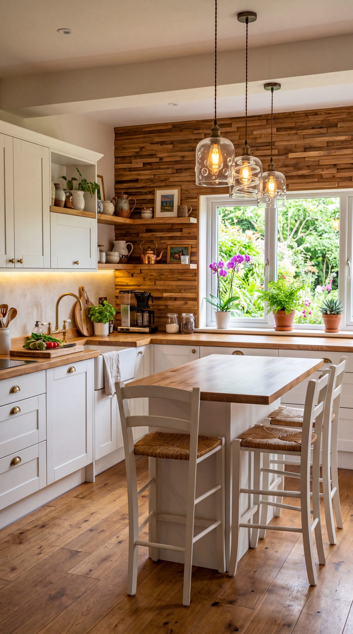
The horizontal timber wall is the visual anchor. Its varied brown tones introduce movement that flat paint could never provide, while the narrow plank pattern makes the surface feel handcrafted rather than formal. Because the planks run horizontally, they also make the back wall appear wider—a useful trick in a room where a central island occupies much of the floor.
The most important decision is restraint. The designer did not wrap every wall in wood. Concentrating the texture on one plane creates a focal point and prevents the kitchen from becoming visually heavy. White trim around the window gives the eye a clean break between the active grain and the garden view, so both features remain distinct.
Why the white cabinetry still feels warm
White shaker-style cabinetry provides the calm background this room needs. The recessed-panel doors add just enough shadow and traditional character to sit comfortably beside the rustic wall, but their simple geometry keeps the kitchen from drifting into a themed farmhouse look.
The white appears slightly soft rather than icy. That matters because a blue-white finish could clash with the amber wood and warm bulbs. Small brass knobs, cup pulls, and the curved faucet repeat the golden tones already present in the timber. These details prevent the cabinets from feeling like a separate, colder layer.
A color palette built from the view outside
The base palette is disciplined: soft white, honey and walnut browns, aged brass, and a small amount of dark bronze or black in the pendant cords. The window then supplies the lively colors. Leaf green, the purple orchid, terracotta pots, vegetables, and garden flowers act as natural accents instead of permanent decorating commitments.
This approach makes the kitchen easy to refresh. The architectural materials remain neutral and long-lasting, while plants, flowers, pottery, tea towels, and produce can shift with the season. Even the bright orchid works because it is surrounded by quieter greens and warm earth tones.
The lighting is doing more work than it seems
Four light sources appear to cooperate here. The large window brings broad daylight into the work zone. Recessed ceiling fixtures provide even general illumination. Under-cabinet lighting brightens the sink and preparation counter. Finally, three glass pendants bring focused warmth over the island.
The clear pendant shades are a smart choice in a modest room. They create sparkle and definition without blocking the sightline toward the window or adding a heavy visual ceiling. Their slightly different glass patterns introduce individuality, while the matching warm bulbs and hardware make the trio feel intentional. Hanging them at staggered positions reinforces the relaxed, collected character of the space.
The island behaves like a piece of furniture
Rather than using an oversized block of cabinetry, the island has the proportions of a sturdy kitchen table. Its warm wooden top echoes the perimeter worktops, while the white base connects it to the cabinets. This helps the island feel integrated without making it visually bulky.
Three woven-seat chairs add texture and make the center of the kitchen useful for breakfast, coffee, homework, or conversation. Their slim backs allow light and views to pass through. The arrangement also demonstrates an important planning lesson: an island does not need to contain a sink, cooktop, or dramatic waterfall edge to earn its place. Sometimes a generous work surface and comfortable seating are the most valuable functions.
Closed storage and open display are carefully balanced
The tall cabinet on the left handles the visual weight of everyday storage, allowing the corner shelves to stay open and decorative. Pottery, pitchers, framed art, and a copper kettle soften the hard working surfaces and make the room feel inhabited. The shelves also bridge the transition between the white cabinetry and the wood wall.
Open shelving works best when it is selective. Here, the displayed objects share a quiet palette of cream, clay, copper, and muted brown. The grouping feels collected, but not chaotic. Most practical items can remain behind doors, while a smaller group of attractive pieces provides personality.
The window is treated as part of the design
The wide window is more than a source of light. It functions almost like a living artwork, framed in white against the timber wall. The row of herbs and houseplants strengthens that effect by bringing the garden onto the sill. Their changing height creates a gentle rhythm without completely blocking the view.
Placing plants near the preparation area also makes sense for daily use. Herbs are easy to reach, and the greenery visually softens the long line of countertop. A successful version of this idea would preserve enough clear sill and counter space for cleaning, watering, and opening the window.
The layout supports real movement
The working surfaces wrap the perimeter while the island occupies the center. The sink sits beneath the left-side preparation zone, with small appliances gathered toward the back corner rather than scattered across every counter. That leaves a useful stretch of wood worktop for washing, chopping, and serving.
The island appears narrow enough to maintain circulation around it. This is essential: the beauty of an island disappears if cabinet doors collide or two people cannot pass comfortably. The image suggests a room designed around modest proportions, not showroom scale, which is one reason it feels achievable.
Small details keep the rustic theme sophisticated
The room repeats materials without matching them too perfectly. Wood appears on the wall, floor, shelves, worktops, cutting boards, island top, and chair seats, but the tones vary. Brass returns in the faucet, cabinet hardware, and pendant fittings. White repeats across cabinets, trim, walls, island base, pottery, and chairs.
Those repetitions create unity. At the same time, subtle variation prevents the kitchen from looking like a catalog set. The copper kettle, handmade-looking ceramics, coffee machine, jars, vegetables, and plants provide evidence of use. A beautiful kitchen becomes more convincing when it still looks ready to make breakfast.
How to recreate the look without rebuilding everything
- Start with one textured surface. Use reclaimed timber, wood-look panels, or a high-quality veneer on a single focal wall rather than covering the entire room.
- Warm up white cabinetry. Choose a soft white and pair it with timber worktops, brass hardware, or warm under-cabinet lighting.
- Layer the lighting. Combine general ceiling light, task lighting, and one decorative fixture instead of expecting a single source to do everything.
- Keep the island visually light. A table-style base, slim seating, and a simple wood top can provide function without overwhelming a narrow plan.
- Repeat finishes thoughtfully. Use the same metal family in at least two or three locations, then allow the wood tones to vary naturally.
- Display less, but display better. Reserve open shelves for a small collection of pottery, art, or cookware that shares a coherent palette.
- Use living color. Herbs, houseplants, fruit, vegetables, and flowers bring energy without locking the room into a trend.
Why this kitchen feels memorable
The room succeeds because it understands the difference between rustic and rough, and between modern and cold. Its white surfaces create clarity. Its wood provides age and texture. The brass and amber light add glow. The greenery brings movement and life. No single element has to carry the entire design.
The most useful lesson is not to copy every detail. It is to build a room through relationships: one bold texture supported by quiet cabinetry, warm metals repeated across the plan, practical lighting at several levels, and personal objects used with restraint. That is what gives this kitchen its easy, welcoming character—and what can make the same approach work in homes of many different sizes.