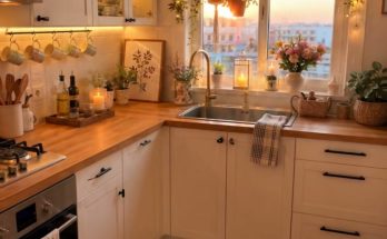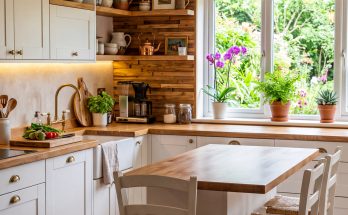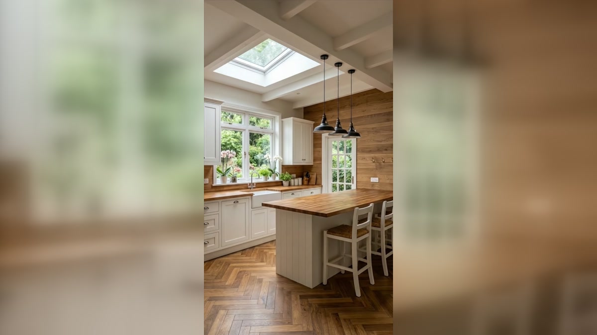
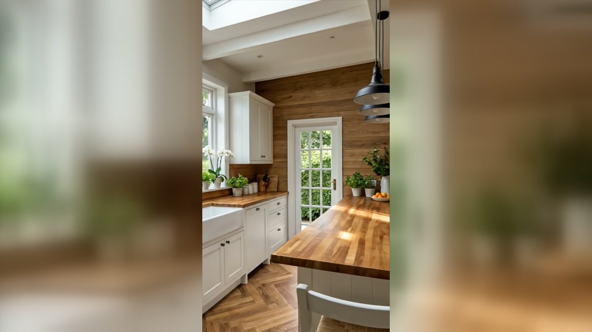
A bright white kitchen can look clean and polished, yet still feel strangely flat. This room avoids that problem completely. Its calm comes from the white cabinetry, but its character comes from what surrounds it: a broad skylight, a wall wrapped in warm timber, a thick wood worktop, herringbone flooring, and a line of dark pendants that gives the ceiling a clear rhythm.
The first impression is peaceful, but the design is far from passive. Every major surface has a job. The pale cabinetry reflects daylight. The timber absorbs some of that brightness and prevents glare. The patterned floor adds movement without introducing another color. Even the black lighting is doing more than adding contrast; it visually lowers the tall ceiling over the island, making the work zone feel comfortable and human in scale.
The skylight is the real starting point
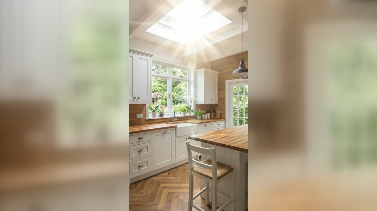
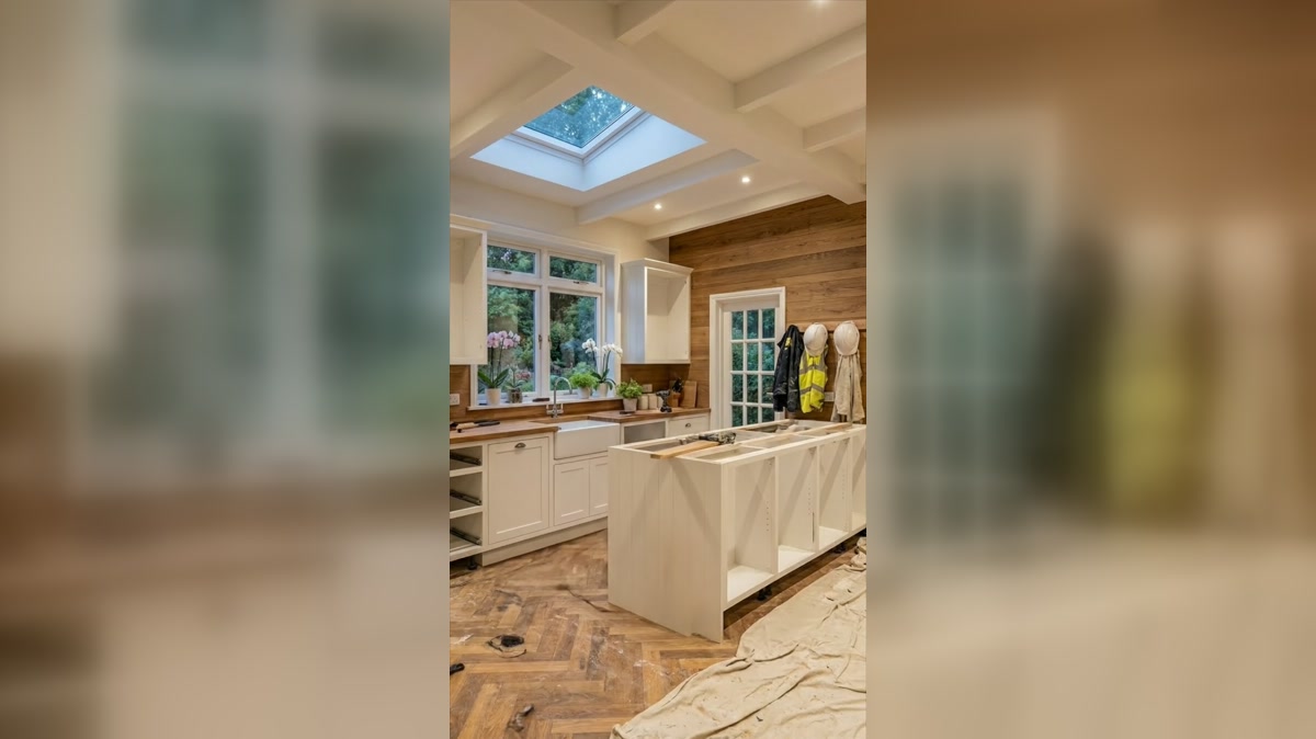
The most important feature is not the island or the cabinetry. It is the skylight above them. Natural light enters from the roof and spreads evenly across the room instead of coming only from one side. That matters in a kitchen because strong side light can leave upper cabinets bright while worktops and corners remain shadowed. Here, the overhead opening gives the center of the plan the same attention as the perimeter.
The ceiling beams make the skylight feel integrated rather than added as an afterthought. Their pale finish keeps them from becoming heavy, while their repeated lines guide the eye toward the timber feature wall. This is a useful lesson for any extension or renovation: when a roof opening is large, the surrounding ceiling structure should help frame it. Otherwise, the glass can look like a random rectangle floating above the room.
Why the white cabinets do not feel cold
The cabinetry uses a classic framed door rather than an ultra-flat modern slab. That small amount of shadow detail softens the white and makes it feel more furniture-like. The hardware is dark and modest, so it connects to the pendants without demanding attention. Nothing is glossy. The low-sheen finish allows daylight to glow across the doors instead of bouncing sharply back into the room.
Warm timber appears in three large planes: the counters, the tall wall, and the floor. Because the wood is repeated at different heights, it feels like part of the architecture rather than a decorative accent. The island worktop is especially effective. Its thickness gives the center of the room visual weight, while the long grain leads the eye toward the stools and the garden door.
The floor quietly does the organizing
Herringbone flooring introduces diagonal movement beneath a room made mostly of straight horizontal and vertical lines. It makes the kitchen feel less rigid, but it also helps visually connect the sink run, island, and doorway. The medium-brown tone is a smart bridge between the lighter counters and the darker knots in the wall cladding.
If you wanted to recreate this effect on a smaller budget, the floor would be worth prioritizing before decorative accessories. A well-chosen floor influences every view of the kitchen and will still matter after plants, stools, and pendant lights are changed.
A simple palette with precise proportions
The color formula is roughly sixty percent warm white, thirty percent natural wood, and ten percent black and green accents. That balance is why the room feels calm but not washed out. White remains the background. Timber occupies enough surface area to create warmth. Black appears only where the room needs definition, and living plants bring in a small amount of fresh color around the windows.
The timber wall is particularly important because it sits opposite so much pale cabinetry. Without it, the room could feel like a white box. With it, the far end becomes a destination. The paneling also gives the garden door more presence and makes the transition outdoors feel intentional.
The island is sized for daily life
This is not an oversized showpiece island. It is long enough for preparation and casual seating, yet narrow enough to preserve comfortable circulation. The stools tuck under the overhang, keeping the path clear when nobody is sitting there. A paneled base connects it to the cabinets, while the wood top distinguishes it as the social center of the room.
Notice that the pendant lights are grouped in a straight line and centered over the island rather than the entire room. This creates a smaller visual room within the larger kitchen. At night, that pool of light would make the island feel intimate even though the ceiling is high.
How to get the look
- Choose a creamy or warm white rather than a blue-based brilliant white.
- Repeat one timber tone on at least two major surfaces so it feels architectural.
- Use dark pendant lights and small dark hardware as punctuation, not as the dominant color.
- Add a herringbone or chevron floor when the cabinet plan is very linear.
- Keep window styling minimal so plants and garden views supply the soft color.
- If a skylight is possible, place it over the island or main preparation zone rather than an empty walkway.
The detail most people miss
What makes this kitchen memorable is not any single luxury material. It is the way the design moves from bright to warm and back again. The skylight creates the glow, white cabinets distribute it, timber softens it, and black fixtures give it edges. That sequence is the reason the room feels peaceful instead of merely pale.
For homeowners planning a similar kitchen, the lesson is reassuring: warmth does not require filling a room with color or decoration. A restrained palette can feel deeply inviting when the light, grain, texture, and proportions are working together.