Long kitchens are often treated as a compromise. Cabinets line the walls, circulation becomes a corridor, and the room can feel narrower with every storage decision. This design turns that problem around. Instead of fighting the length, it celebrates it with a slim island, a continuous wall of glass, repeated skylights, and a floor pattern that keeps the eye moving.
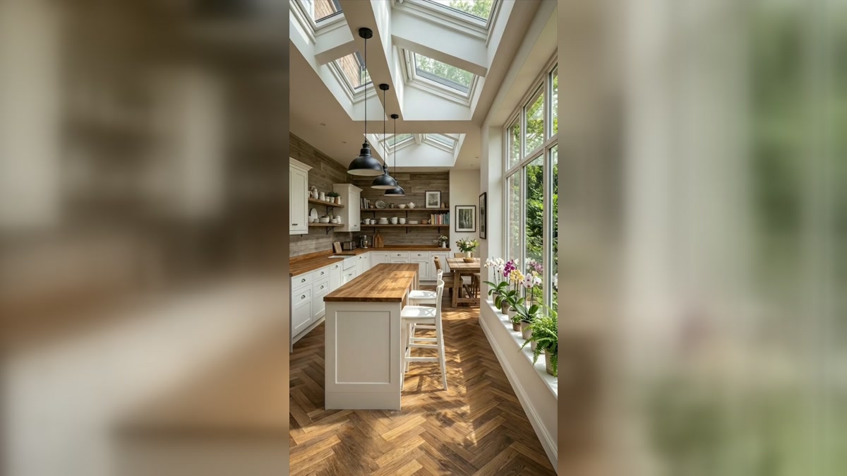
The finished room feels open not because it has less function, but because the heaviest elements are carefully concentrated. Tall cabinetry and appliances sit together. Open shelves replace some upper cabinets. The window wall remains almost completely unobstructed. Light enters from above and from the side, so even the center of the plan feels connected to the garden.
Three design moves create the sense of space
The first move is obvious: the large window wall. It replaces a solid boundary with a deep view into greenery. The second is overhead glazing. A sequence of roof lights distributes brightness along the room rather than illuminating only one end. The third is the island proportion. It is long and narrow, following the architecture instead of trying to become a wide square centerpiece.
Together, these moves create parallel lines that feel organized rather than cramped. The eye is invited forward toward the dining table, while the garden view prevents the side wall from feeling close.
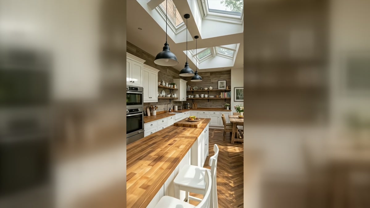
The island is a guide, not an obstacle
In a narrow plan, an island can quickly become a barrier. Here, its reduced depth preserves clear walking space on both sides. The stools are slim and tucked under the worktop, and the pale paneled base visually merges with the cabinetry. A timber top gives the island identity without making its volume look heavier.
The island also reinforces the room’s direction. Its long edge points toward the table, linking preparation and dining. This is a useful strategy in any open-plan extension: furniture and cabinetry should guide movement toward the next zone rather than block it.
Why the cabinet wall feels lighter than it is
The working wall contains substantial storage, but it does not read as a solid mass. White lower cabinets recede into the bright room. Open timber shelves break up the upper level. Repeated dishes and small objects create a lived-in texture without closing the wall off.
Wood cladding behind the shelves and counters forms one continuous warm band. That horizontal line makes the room feel wider, while the white cabinet doors below keep the storage calm. Dark ovens and pendant lights are grouped into a few clear accents instead of scattered throughout the space.
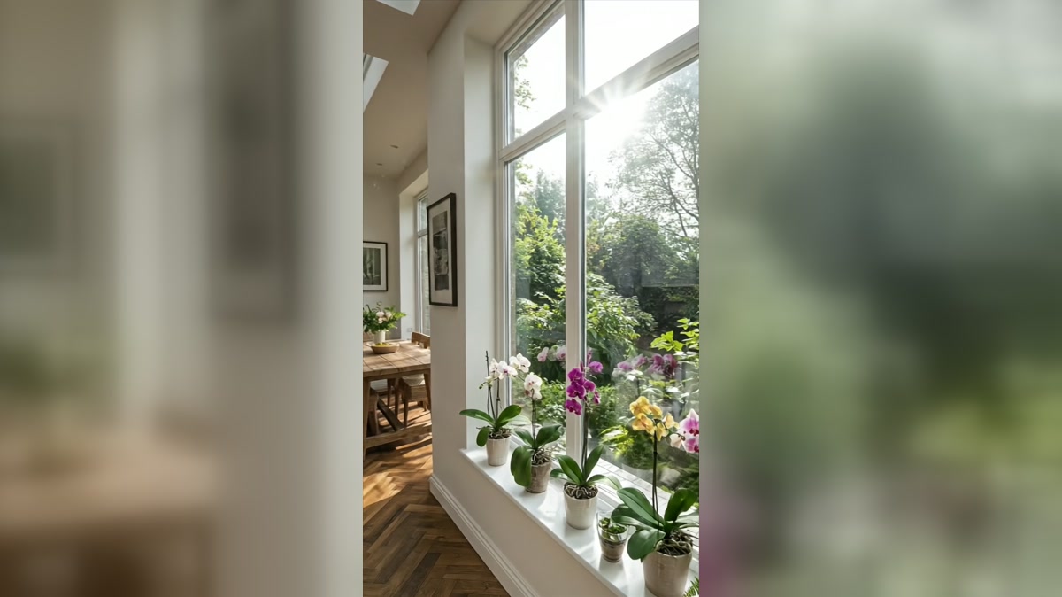
The herringbone floor changes the geometry
A straight plank floor running the length of the room could exaggerate the corridor effect. Herringbone introduces diagonal lines, making the floor feel broader and more animated. Its medium timber tone connects the island top, wall cladding, shelves, and dining table.
The pattern also adds visual detail at the lowest level, which allows the cabinetry and walls to remain simple. This balance is important: a room can have one expressive surface without becoming busy if the surrounding elements stay restrained.
Plants become part of the architecture
A row of orchids and leafy plants sits along the deep window ledge. They soften the transition between the clean interior and the mature garden outside. The repetition is more powerful than one oversized plant; it creates a living rhythm that follows the length of the glazing.
Because the plants are concentrated at the window, worktops remain functional. This is a practical styling lesson for busy kitchens: group decorative items in a zone that already has strong natural light instead of spreading them across every preparation surface.
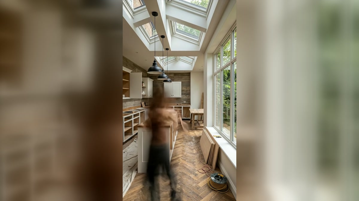
How to make a narrow kitchen feel generous
- Keep tall cabinets and appliances together rather than alternating them with worktop sections.
- Use a slim island that follows the room’s length and preserves circulation.
- Replace selected upper cabinets with open shelving where storage pressure allows.
- Bring light from more than one direction, especially through roof glazing.
- Use diagonal floor patterns to counter a corridor-like plan.
- Reserve one window ledge or shelf for plants and keep the main counters clear.
Why this room works
The design never tries to disguise the kitchen’s long footprint. Instead, it turns that length into a sequence: cooking, preparation, casual seating, and dining. Each part has its own place, but the consistent materials make them feel connected.
The result proves that a narrow kitchen does not need to feel compromised. With controlled cabinet mass, carefully sized furniture, diagonal floor movement, and abundant daylight, length can become the room’s greatest advantage.